




Platinumlist is the leading event ticketing platform in the UAE and across the region, where people find and book concerts, attractions, and experiences. I lead the work on its mobile app (a full redesign and rebrand, plus a new flagship feature, Smart Tickets), turning it from an add-on to the website into the main way people discover what's on around them.
Almost everyone booked on the website. The app was the afterthought. You opened it to pull up a ticket you'd already bought, and that was about it. Nobody came to the app to look around.
I joined just as the team was rebranding, leaving the old look behind for something more modern. My job was to rebuild the whole app on the new colours, type, and positioning, and use that reset to change what it's for, from a place you check a ticket to a place you come to see what's on.
Pull people off the website and onto the app, and make mobile the main way they use Platinumlist. The way to earn that is to give them a real reason to browse on their phone, and a ticket experience they could only get in the app.
As Senior Product Designer, I ran the redesign end to end.
This was a redesign of the whole app, every screen, not just one part of it. I reworked all of it on the new brand, finding events, the event pages, checkout, and the tickets you've bought. And we added a new main feature, Smart Tickets.
The app didn't do anything the website couldn't, so people had no reason to switch. And the ticket was just a static QR code, the same as a screenshot or a PDF. Once you'd bought it, nothing pulled you back to the app.
So we added a new feature, Smart Tickets. QR codes that keep refreshing in real time, right inside the app. A screenshot won't scan, so the ticket only works in the app. To walk into an event, you need your phone with Platinumlist open.
Smart Tickets became the main reason to download the app, the thing that moved people off the web, and a big part of why daily active users jumped.
The app worked like a till. You came in knowing what you wanted, paid, and left. There was nothing to browse, so between purchases there was no reason to open it at all.
I built the home screen around discovery instead, personalised feeds that show you concerts, attractions, and experiences based on what you like and what's happening nearby. Now there's something to look at, not just something to pay for.
Average session time went up 25%, and the feeds kept people coming back between bookings.
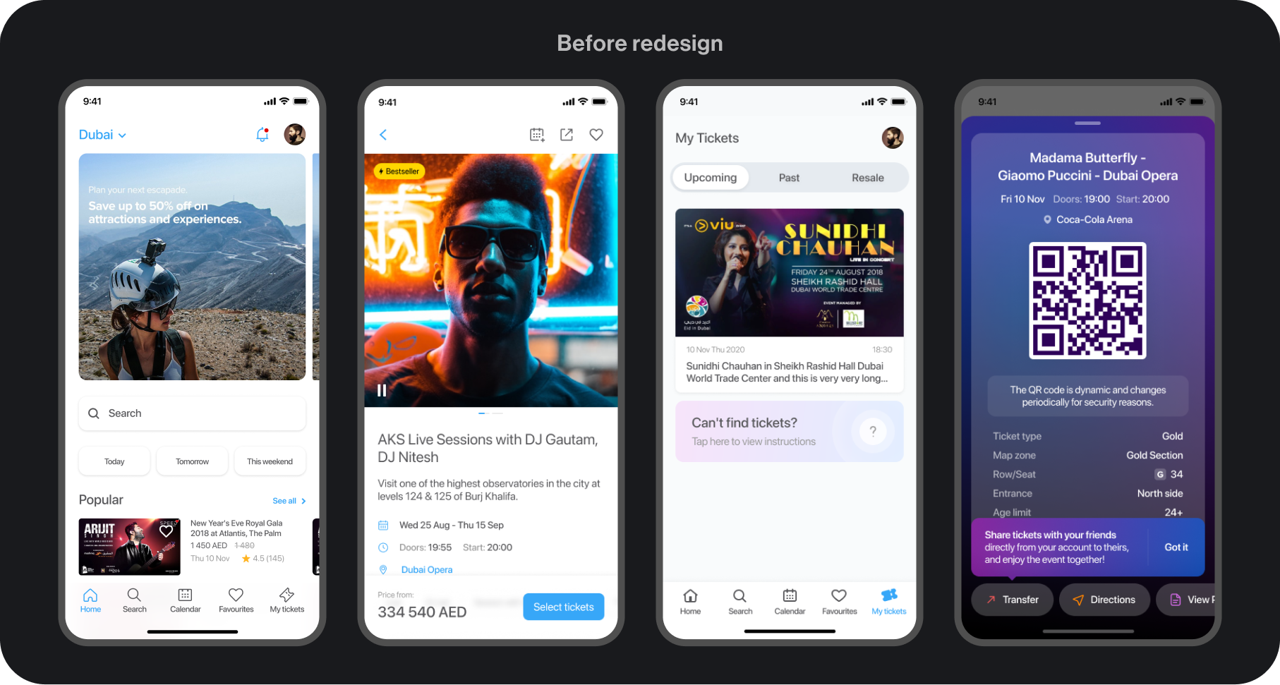
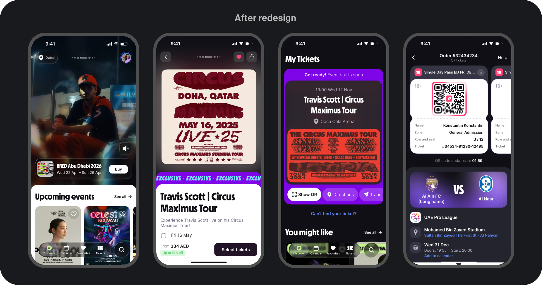
I joined in the middle of the rebrand, so I was designing the new app and working out what «new» even meant at the same time, new colours, new type, new positioning, all still settling.
A few things made it harder. Every decision went through the founder personally. I presented the work to him and defended it, screen by screen. There was no design system to lean on either, the old files were built out of groups and frames instead of proper components and auto-layout, so I more or less built one from scratch as I went. And with no analytics or past research, the early calls came down to craft and judgement rather than data.
When the redesign was finally done, we put it in front of real data. We ran a usability study first, then A/B-tested the launch. Nothing dropped on release, and the numbers kept climbing after.
That one stuck with me. Shipping the redesign wasn't the finish line; it was the point where we could finally start measuring. And the unglamorous parts (building the design system, getting the team into the habit of testing) ended up mattering as much as the screens did.